Article
Recognition comes from repetition, not from a beautiful logo
A new study of 1,162 brand assets shows that no type of asset carries a brand on its own, and most of them aren’t known widely enough. I show what that means for your corporate design.

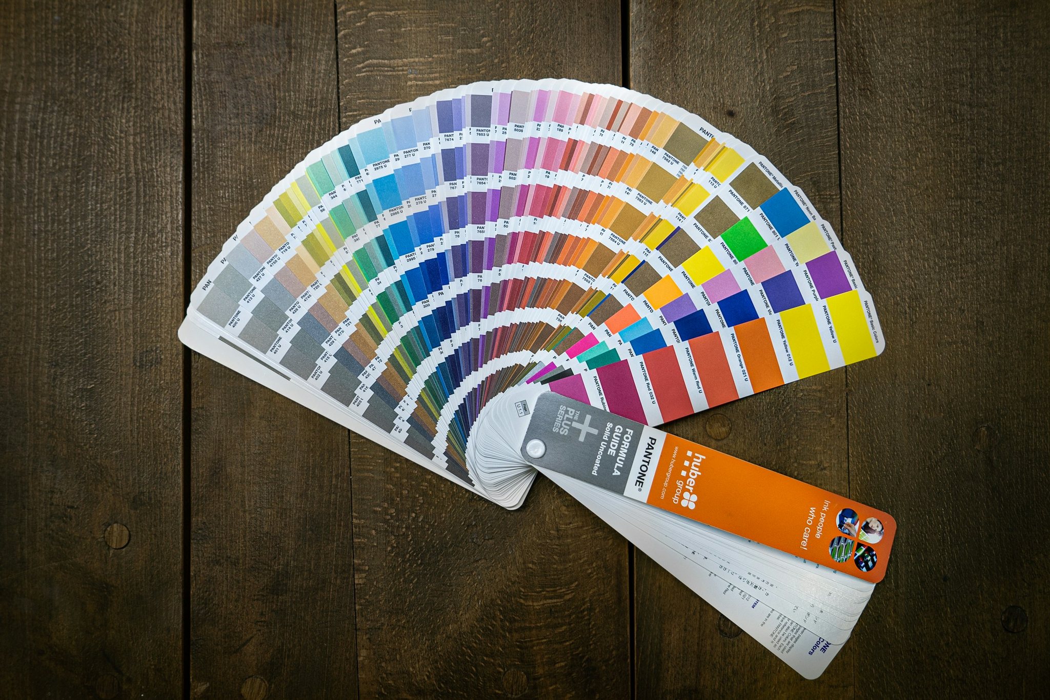
When the talk turns to a new corporate design, the first meeting is almost always about the logo. That’s understandable: the logo is the most visible part of a brand, and it ends up on every business card and every profile picture. But people rarely recognize a brand by its logo alone.
They recognize it by an interplay of shape, color, type, images and tone that they encounter the same way again and again. The research on this is fairly clear. And it shifts the focus: away from the one brilliant idea, toward a system you keep up for years.
People don’t look closely, they recognize
Hardly anyone looks at a website, a post or a company van attentively. We scroll, drive past, skim. In experiments by researcher Gitte Lindgaard and her team, around 50 milliseconds were enough to decide whether a website was appealing. That’s shorter than the blink of an eye.
What counts in that moment is the overall impression. In a large Stanford University study, 2,684 people rated how credible websites seemed to them. The look, meaning layout, type, colors and images, came up in 46.1 % of comments, more often than any other criterion. Design isn’t decoration. It’s the first thing people judge you by.
Marketing scientist Byron Sharp calls the goal mental availability: your brand should come to mind when people need something you offer. That takes memory structures, and they only form when the same cues show up again and again. One of his rules, roughly: stay consistent, but fresh.
No brand asset makes it on its own
How strong individual brand assets really are was published in 2026 in the International Journal of Advertising by a team led by Peilin Phua and Byron Sharp. The researchers analyzed 1,162 brand assets from 21 categories in four countries: logos and shapes, colors, characters, slogans, sounds.
For each asset, they measured how many people link it to the right brand without seeing the brand name. That’s fame. And how often it’s really that brand that gets named, and no other. That’s uniqueness. An asset that reaches at least 50 % on both can carry the brand on its own. The result:
- Shapes are strongest. Logos and distinctive shapes reach 40 % fame and 71 % uniqueness on average.
- Color is weakest. On average it gets 12 % fame and 39 % uniqueness.
- No asset type reaches the target zone on average. The average asset sits at 26 % fame and 54 % uniqueness.

For service businesses, the picture is somewhat better, but not fundamentally different: shapes reach 45 % fame there, color 18 %. The study is based on large brands in English-speaking countries. A small business with less reach is unlikely to get there any faster.
The problem is rarely the design, it’s the fame
The most important sentence of the study is in the discussion: most brand assets are unique enough, but too few people know them. Building fame is therefore the main task. Uniqueness, the authors write, is even harder to build than fame.
For small businesses, that’s good news. You don’t need to invent a new logo every two years. You need to show your good logo, your colors and your type as often and as consistently as possible: on your website, in your proposals, on Instagram, on your company car, in your email signature.
Data from advertising effectiveness research also shows that patience pays off. In an analysis by System1 and the Effie Awards, campaigns with a recurring character reported gains in distinctiveness (46 % vs. 15 %) and awareness (49 % vs. 24 %) far more often. And in the long-term analysis by Les Binet and Peter Field for the UK advertising body IPA, the share of emotional campaigns with very large profit effects rises from 13 % after one year to 43 % after three years or more.
Color alone isn’t enough, and the 80 percent are a myth
Hardly any number gets quoted as often in branding as this one: color supposedly increases brand recognition by up to 80 %, backed by a study from Loyola University. The earliest traceable source, however, is a sales sheet from printer manufacturer Xerox that gives the same 80 % for several other effects as well. The Loyola study many people cite looked at how quickly and accurately people read tables and charts. It wasn’t about brands at all.
The 2026 study points the other way: on average, color is the weakest brand asset. The authors consider color risky as the only identifier; it works better together with stronger assets. My green doesn’t work because it’s green. It works because it always appears together with the MRT square, the same typeface and the same imagery.
What a corporate design needs to define
A good corporate design isn’t a logo with a color palette. It’s a set of rules that makes sure your brand shows up the same way everywhere, even when you’re not standing next to it. For me, five things belong in it.
1. A shape that’s yours alone
According to the study, shapes are the strongest brand assets. That can be the logo, but also a recurring mark, a frame or a pattern. What matters is that it’s simple enough to work everywhere, from the favicon to the vehicle wrap.
2. Color only as part of a package
Define a few colors and always use them together with your shape. A house color on its own is almost always shared with someone in your industry.
3. Type and tone
A fixed typeface and a recognizable way of writing are quieter than a logo, but they work on every channel. Especially where there’s no room for a logo, in emails, proposals and captions, the tone carries the brand.
4. Rules anyone can apply
Brand guidelines aren’t a binder for the shelf. They’re the manual that lets your print shop, agency or your own team use the brand correctly. The clearer the rules, the less improvising.
5. Patience
Many brands don’t fail because of bad design, but because they change too early. When you’re getting tired of your own brand, your customers are only just starting to recognize it.
An example from my work
For Zukunftswache, a financial and insurance broker for police officers, I therefore didn’t think of the brand through the logo alone. A distinctive mark reminiscent of a police insignia, strong blue with neon yellow and a set of illustrated characters appear together: on the website, in social media posts, on posters and on the stationery.
Each of these elements would be interchangeable on its own. Together, they’re meant to make the brand recognizable even when the logo isn’t in view. The characters have a second job, too: they tell financial topics in a way people enjoy reading.
The test for your brand
Before you think about a new logo, try a simple test: cover the logo on your website, your latest post and your last proposal. Can people still tell it’s all from you? If not, you don’t need a new logo. You need a system.
That’s exactly what I develop for my clients: a corporate design that’s thought through from the brand core to the vehicle wrap and holds up in everyday use. If you want to know where your brand stands, get in touch.
Sources
- Phua, P., Bali, L., Anesbury, Z. & Sharp, B. (2026): Shape-based assets are strongest: benchmarking distinctive brand asset performance across industries. International Journal of Advertising. doi.org/10.1080/02650487.2026.2637295
- Romaniuk, J. (2018): Building Distinctive Brand Assets. Oxford University Press.
- Sharp, B. (2010): How Brands Grow. Oxford University Press.
- Lindgaard, G., Fernandes, G., Dudek, C. & Brown, J. (2006): Attention web designers: You have 50 milliseconds to make a good first impression! Behaviour & Information Technology 25 (2). doi.org/10.1080/01449290500330448
- Fogg, B. J. et al. (2002): How Do People Evaluate a Web Site’s Credibility? Stanford Persuasive Technology Lab and Consumer WebWatch. advocacy.consumerreports.org
- System1 & Effie (2026): The Creative Dividend. system1group.com/the-creative-dividend
- Binet, L. & Field, P. (2013): The Long and the Short of It. IPA. ipa.co.uk
- Hoadley, E. D. (1990): Investigating the effects of color. Communications of the ACM 33 (2). doi.org/10.1145/75577.75578