Article
Accessible websites start with corporate design, not with code
A new check of around 6,000 local business websites shows that on almost nine in ten, text stands out too little from its background. That is rarely a coding error, but a colour decision. In five charts, I show where things go wrong and what you can do now.

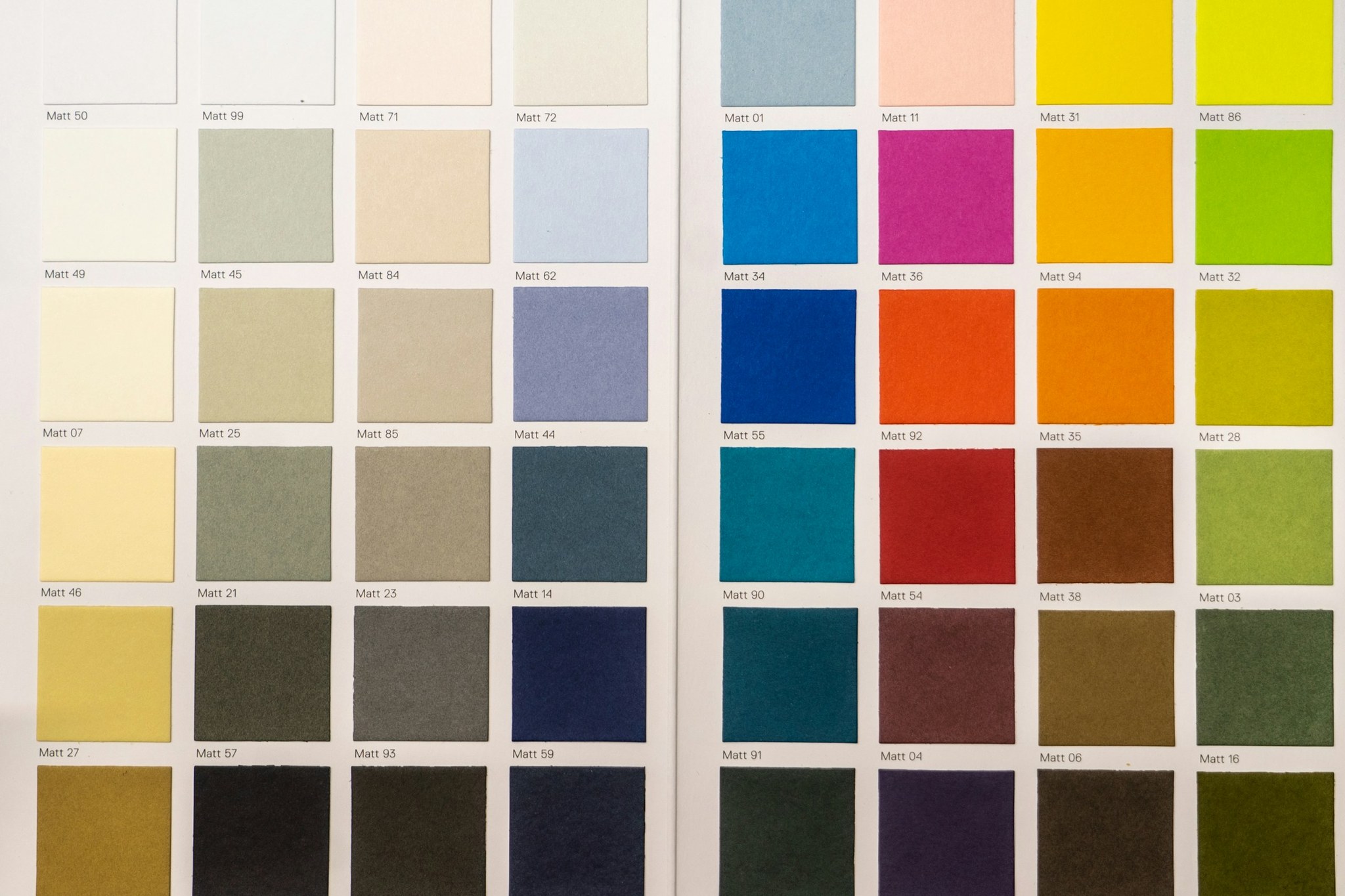
In August, the testing portal Barrierewerk ran automated checks on 11,000 websites, including 10,000 belonging to businesses across Germany: practices, restaurants, hotels, garages and trade businesses. The most common error was not broken technology. It was colour. On 86.7 % of the fully checked business websites, text does not stand out enough from its background.
That decision is made long before the first line of code: in the corporate design.
Accessible websites: the most common error is colour
Barrierewerk checked two samples: 678 of the most visited German websites and 5,994 websites of local businesses, each with the home page and up to four subpages. Both groups share the same top three errors: too little contrast, links and buttons without a name, and headings in the wrong order. Each affects more than 83 % of sites.

Only 0.5 % of business websites had no automatically detectable error at all. And reach is no protection: every single one of the ten most visited websites in the sample had contrast problems.
Garage, practice or café: the sector makes little difference
The share barely varies between sectors. 89.2 % of car repair shop websites have weak contrast, 89.3 % of dental practices and 87.5 % of restaurants. The study gives no separate figure for the trades, so I analysed the open raw data: of 424 trade business websites, 369 have contrast errors, which is 87 %.

The study names typical causes: light greys, text on photos, gradients and semi-transparent areas. In other words, exactly what many website templates use to look modern.
Worldwide, things are not getting better either
Every year, the US organisation WebAIM checks the one million most visited home pages in the world. Too little contrast has been the most common error there since measurement began in 2019. After years of slight improvement, the share rose again to 83.9 % in 2026, with an average of 34 affected text passages per page.

Corporate design is where the decision is made
How well text stands out can be calculated. The international Web Content Accessibility Guidelines, WCAG for short, require a contrast ratio of at least 4.5:1 for normal text and 3:1 for large text. Black on white reaches 21:1.
Many popular brand colours fail as text on white: yellow, orange, light grey. Even my own signal green only reaches 1.3:1 on white. On black, the same colour reaches 15.6:1.

That is why every corporate design needs a clear rule: which colour may appear as text on which background, and which only as an area or accent? Once that is set, every new page, ad and flyer is readable by default. Without the rule, someone different decides by gut feeling every time.
Good contrast helps more people than you think
At the end of 2025, just over 7.8 million people in Germany lived with a severe disability, 9.4 % of the population. 79 % of them are aged 55 or over. In 4 % of cases, the cause is blindness or a visual impairment. Milder visual impairments are not covered by the statistics at all.

But good contrast benefits everyone: people reading their phone in the sun, people who don’t have their glasses on, people sitting at an old screen.
And the law? Germany’s Accessibility Strengthening Act (BFSG), which implements the European Accessibility Act, has applied since 28 June 2025. It mainly covers services through which consumers conclude a contract online, such as online shops. Micro-enterprises with fewer than ten employees and no more than 2 million euros in annual turnover or balance sheet total are exempt for services. According to Barrierewerk, most businesses in the study therefore do not fall under it at all. Barriers can still be reported: the German states’ market surveillance authority has had its own website with a reporting form since June. If in doubt about whether your business is covered, get legal advice.
How solid are the figures? Barrierewerk sells a testing tool itself, but discloses its method and raw data. I recalculated the values. Automated tests only find some barriers, so the real situation is likely to be worse.
What you can do now
- Measure your brand colours. Free tools such as the WebAIM Contrast Checker show within seconds whether a combination reaches 4.5:1.
- Define colour pairs. Write into your style guide which colour may be used as text on which background. Light accent colours get dark text or stay as areas.
- Check the usual suspects. Light grey body text, text on photos, white text on light buttons and text on gradients.
- Look beyond the home page. Forms, subpages and booking flows are often less well maintained than the home page.
- Label icons and order headings. Icon buttons need a name, headings a clean order. Both take diligence, not a rebuild.
I develop corporate designs with colour pairs that are readable from the start, and build websites that apply them consistently. Why fixed brand rules pay off so much is explained in the article on recognition through repetition. If you want to know how readable your colours are, get in touch.
Sources
- Barrierewerk (2026): BFSG-Praxisstudie 2026. Wie barrierefrei sind deutsche Websites wirklich? (How accessible are German websites really?), Döbern, part 1 collected 10 August 2026 (678 websites fully checked), raw data under CC BY 4.0, DOI 10.5281/zenodo.21939228; in German. barrierewerk.de
- Barrierewerk (2026): Barrierefreiheit von Betriebswebsites. 10.000 Betriebe geprüft (Accessibility of business websites: 10,000 businesses checked), part 2 of the BFSG-Praxisstudie, collected 12 August 2026 (5,994 websites fully checked); in German. barrierewerk.de
- WebAIM (2026): The WebAIM Million. The 2026 report on the accessibility of the top 1,000,000 home pages, Logan (Utah), as of 30 March 2026. webaim.org
- W3C (2024): Web Content Accessibility Guidelines (WCAG) 2.2, W3C Recommendation, 12 December 2024, criteria 1.4.3 and 1.4.11. w3.org
- Federal Statistical Office of Germany (2026): 7,8 Millionen schwerbehinderte Menschen leben in Deutschland (7.8 million severely disabled people live in Germany), press release no. 246, Wiesbaden, 13 July 2026; in German. destatis.de
- Barrierefreiheitsstärkungsgesetz (BFSG, Accessibility Strengthening Act) of 16 July 2021, section 2 nos. 17 and 26, section 3 (3); in German. gesetze-im-internet.de
- Bundesfachstelle Barrierefreiheit (2026): Website der Marktüberwachungsstelle ist online (Market surveillance authority website is online), news item, 8 June 2026; in German. bundesfachstelle-barrierefreiheit.de